Website tinting is transforming how users experience mobile browsing. This subtle design feature creates a seamless connection between your website and the browser interface, making your brand stand out in ways you might not have considered.
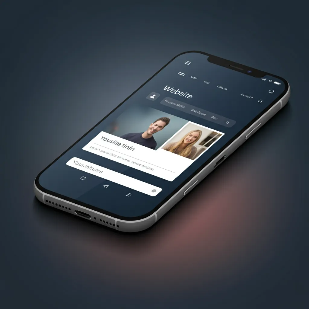
If you've ever noticed your iPhone's Safari browser changing colors to match a website you're visiting, you've experienced website tinting firsthand.
This powerful feature goes beyond aesthetics it enhances user engagement, strengthens brand identity, and creates a more immersive browsing experience.
In this comprehensive guide, we'll explore everything you need to know about website tinting, from its technical implementation to best practices that can elevate your mobile web design.
What is Website Tinting?
Website tinting refers to a browser feature that automatically adjusts the color of the browser's user interface elements to match your website's color scheme.
When implemented correctly, the browser's status bar, address bar, and other UI elements adopt colors from your site, creating a unified visual experience.
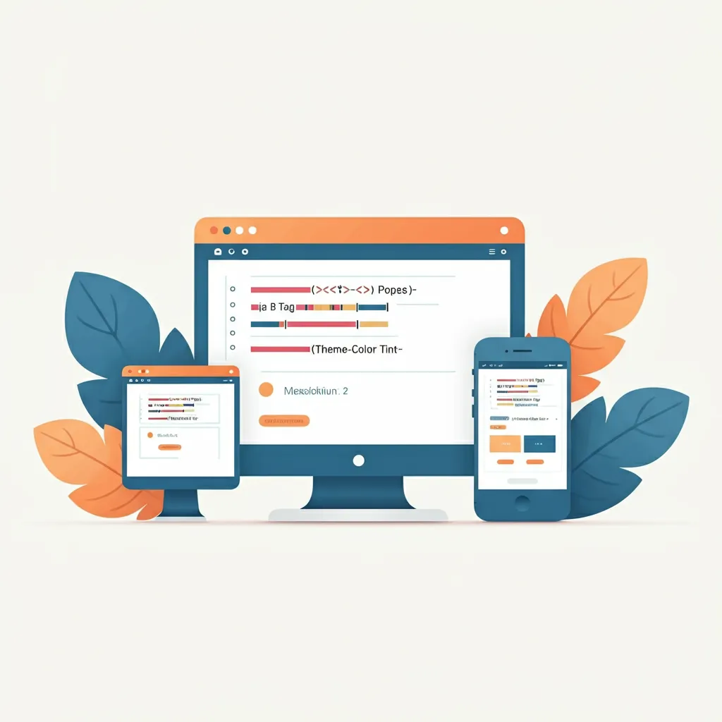
This technique involves using a specific HTML meta tag called theme-color that tells the browser which color to use for its interface.
The browser then applies this color to various UI elements, making your website appear more integrated and professional on mobile devices.
Basic implementation example:
<meta name="theme-color" content="#1a73e8">
Website tinting is particularly effective on mobile devices where the browser interface takes up valuable screen real estate.
By coordinating these colors, you eliminate visual jarring between your site and the browser, creating a smoother user experience.
The Benefits of Website Tinting
Enhanced Brand Consistency
Website tinting extends your brand colors beyond your site's content area. When users visit your site, they see your brand colors reflected in the browser interface itself, creating stronger brand recognition and recall.
Improved User Experience
A cohesive color scheme reduces cognitive load for users. Instead of processing conflicting visual information from your site and the browser interface, users enjoy a harmonious experience that feels intentional and polished.
Mobile-First Design Advantage
With mobile traffic representing over 50% of web usage globally, optimizing for mobile browsers is crucial. Website tinting gives you an edge by making your site feel native to the device, improving engagement and time spent on page.
Professional Appearance
Sites that implement website tinting appear more sophisticated and attention-to-detail oriented. This subtle enhancement can influence user perception of your brand's professionalism and credibility.
Immersive Browsing Experience
By eliminating the visual boundary between your site and the browser, website tinting creates a more immersive experience. This is particularly valuable for e-commerce sites, portfolios, and applications where engagement is critical.
How Website Tinting Works Across Different Browsers
Safari on iOS
Safari offers the most sophisticated website tinting implementation. Starting with iOS 15, Safari supports dynamic tinting that can change based on scroll position or content area. This creates an adaptive experience that responds to your site's design.
Key features:
● Dynamic color adaptation
● Support for light and dark modes
● Integration with iOS status bar
● Responsive to scroll events
Chrome on Android
Chrome on Android provides reliable website tinting through the theme-color meta tag. While less dynamic than Safari, it offers consistent color application across the browser interface.
Features include:
● Static color application
● Status bar customization
● Tab color integration
● Multi-tab support
Firefox Mobile
Firefox mobile browsers also support basic website tinting through the theme-color tag, though implementation may vary slightly from Chrome.
Implementation: The Theme-Color Meta Tag
Basic Implementation
The foundation of website tinting lies in the theme-color meta tag. This simple piece of code should be placed in your HTML document's section:
<meta name="theme-color" content="#your-brand-color">
Advanced Implementation Options
For more sophisticated implementations, you can specify different colors for different contexts:
Light mode
<meta name="theme-color" content="#ffffff" media="(prefers-color-scheme: light)">
Dark mode
<meta name="theme-color" content="#000000" media="(prefers-color-scheme: dark)">
Dynamic Theme Color Changes
Using JavaScript, you can dynamically change the theme color of your website based on user interactions or the scroll position. This is achieved by updating the tag with the name="theme-color" attribute.
How It Works:
Function to Update Theme Color:
A function named updateThemeColor is defined. It takes a color value as a parameter.
Inside the function, it selects the tag with the attribute name="theme-color" and updates its content attribute to the provided color value.
  function updateThemeColor(color) {

      document.querySelector('meta[name="theme-color"]').setAttribute('content', color);

    }
Changing Theme Color on Scroll:
An event listener is added to the scroll event of the window object.
When the user scrolls, the script checks the vertical scroll position (window.scrollY).
If the scroll position is greater than 100 pixels, the theme color is updated to a dark color (#333333).
Otherwise, the theme color is set to a light color (#ffffff).
  window.addEventListener('scroll', function() {

      if (window.scrollY > 100) {

      updateThemeColor('#333333');

      }

      else

      {

          updateThemeColor('#ffffff');

      }

  });
Best Practices for Website Tinting Implementation
Choose Colors Strategically
Your theme color should complement your site's primary brand colors while ensuring good contrast with browser UI elements. Avoid colors that make browser icons or text difficult to read.
Test Across Devices and Browsers
Website tinting behavior varies across different browsers and operating systems. Test your implementation on:
● iOS Safari (multiple versions)
● Chrome on Android
● Firefox mobile
● Different screen sizes and orientations
Consider Accessibility
Ensure your chosen theme colors meet WCAG accessibility guidelines. Poor color choices can make browser interfaces difficult to use for people with visual impairments.
Plan for Dark Mode
Many users prefer dark mode browsing. Implement appropriate theme colors for both light and dark color schemes to provide the best experience regardless of user preference.
Maintain Brand Consistency
Your theme color should align with your overall brand palette. Inconsistent colors can confuse users and weaken brand recognition.
Common Mistakes to Avoid
Using Low-Contrast Colors
Light colors on light backgrounds or dark colors on dark browser themes can make interface elements invisible or hard to read. Always prioritize visibility and usability.
Forgetting the Meta Tag
The most basic mistake is simply forgetting to include the theme-color meta tag. Without it, browsers default to generic colors that don't match your site.
Using Gradients or Complex Colors
Website tinting only supports solid colors. Gradients, patterns, or images won't work and may cause unexpected behavior.
Not Testing on Real Devices
Desktop browser development tools don't always accurately represent how website tinting appears on actual mobile devices. Always test on real hardware.
Ignoring Performance Impact
While website tinting itself doesn't affect performance, complex JavaScript implementations for dynamic color changes can impact page speed if not optimized properly.
Website Tinting and Mobile Web Design
Mobile-First Strategy
Website tinting should be part of a comprehensive mobile-first design strategy. It works best when integrated with responsive design principles and mobile-optimized user interfaces.
Brand Recognition on Small Screens
Mobile screens offer limited space for brand elements. Website tinting helps extend your brand presence beyond your content area, maximizing brand visibility in a constrained space.
User Engagement Benefits
Studies show that cohesive visual experiences increase user engagement. Website tinting contributes to this by creating a more polished, professional appearance that encourages users to spend more time on your site.
Integration with Progressive Web Apps
For Progressive Web Apps (PWAs), website tinting becomes even more important. It helps blur the line between native apps and web applications, contributing to a more app-like experience.
Examples of Effective Website Tinting
Apple.com
Apple uses subtle website tinting that matches their clean, minimalist brand aesthetic. The implementation is particularly effective on product pages where the theme color complements the featured product.
Stripe.com
Stripe employs website tinting as part of their comprehensive brand system. Their blue brand color extends into the browser interface, reinforcing their tech-forward, trustworthy image.
Spotify Web Player
Spotify's web player uses dynamic website tinting that changes based on the currently playing album artwork, creating a immersive music experience that extends beyond the player interface.
SEO and Performance Considerations
SEO Impact
While website tinting doesn't directly impact SEO rankings, it contributes to improved user experience metrics like reduced bounce rate and increased time on page, which can indirectly benefit your search performance.
Performance Optimization
Website tinting has minimal performance impact since it only requires a simple meta tag. However, if you implement dynamic color changes, optimize your JavaScript to avoid unnecessary repaints and reflows.
Core Web Vitals
Properly implemented website tinting shouldn't affect Core Web Vitals metrics. However, avoid heavy JavaScript implementations that could impact your Cumulative Layout Shift (CLS) scores.
Tools and Resources for Implementation
If you're looking to further enhance your website's design and ensure it performs well across devices, check out our guide on how to find the best responsive website development company. It is a valuable resource for optimizing both website tinting and overall responsiveness.
Development Tools
● Chrome DevTools for testing and debugging
● Safari Web Inspector for iOS-specific testing
● BrowserStack for cross-platform testing
Color Selection Tools
● Adobe Color for creating cohesive color schemes
● Coolors for generating color palettes
● Contrast Checker for accessibility testing
Accessibility Resources
Use these tools to ensure your website tinting choices meet accessibility standards:
● WAVE Web Accessibility Evaluator
● axe DevTools
The Future of Website Tinting
Browser Evolution
As mobile browsing continues to evolve, expect more sophisticated website tinting capabilities. Browser manufacturers are likely to introduce more dynamic and context-aware tinting options.
Integration with Design Systems
Website tinting will likely become more integrated with design systems and CSS custom properties, making it easier to maintain consistent theming across complex web applications.
Cross-Platform Standardization
Expect better standardization of website tinting behavior across different browsers and platforms, reducing the need for platform-specific implementations.
Conclusion
Website tinting represents a simple yet powerful way to enhance your mobile web presence. By extending your brand colors into the browser interface, you create a more cohesive, professional, and engaging user experience.
The implementation is straightforward just a single meta tag but the impact can be significant. Users notice polished details, and website tinting is one of those subtle touches that signals professionalism and attention to detail.
Start implementing website tinting today by adding the theme-color meta tag to your site's head section. Choose a color that complements your brand, test across different devices and browsers, and monitor user engagement metrics to measure the impact.
Remember to consider accessibility, plan for both light and dark modes, and avoid common implementation mistakes.
With proper execution, website tinting can become a valuable component of your mobile web design strategy, helping your site stand out in an increasingly competitive digital landscape.
Website Tinting FAQs
What is website tinting?
Website tinting is a browser feature that automatically changes the color of the browser's interface (status bar, address bar, etc.) to match your website's color scheme.
This creates a seamless visual experience between your site and the mobile browser.
How does website tinting work?
Website tinting works through the theme-color meta tag placed in your HTML head section. When browsers detect this tag, they apply the specified color to their interface elements, creating visual continuity with your website.
Which browsers support website tinting?
Website tinting is primarily supported by:
● Safari on iOS (most advanced implementation)
● Chrome on Android
● Firefox mobile
● Limited support on desktop browsers
How do I add website tinting to my site?
Add this meta tag to your HTML head section:
<meta name="theme-color" content="#your-brand-color">
Replace #your-brand-color with your desired hex color code.
Can I use different colors for light and dark modes?
Yes! You can specify different theme colors for different color schemes:
<meta name="theme-color" content="#ffffff" media="(prefers-color-scheme: light)">
<meta name="theme-color" content="#000000" media="(prefers-color-scheme: dark)">
Can I change the theme color dynamically?
Yes, you can use JavaScript to update the theme color based on user interactions, scroll position, or other triggers. This is particularly effective for single-page applications or interactive websites.
Do gradients work with website tinting?
No, website tinting only supports solid colors. Gradients, patterns, or images will not work and may cause unexpected behavior.
What color should I choose for my theme color?
Choose a color that:
● Matches your brand palette
● Provides good contrast with browser UI elements
● Works well in both light and dark modes
● Maintains readability of browser icons and text
Does website tinting affect SEO?
Website tinting doesn't directly impact SEO rankings, but it can improve user experience metrics like reduced bounce rate and increased time on page, which may indirectly benefit search performance.
How can I test if my website tinting is working?
Test your implementation by:
● Viewing your site on actual mobile devices
● Using browser developer tools
● Checking multiple browsers (Safari iOS, Chrome Android)
● Testing in both light and dark modes
What are common mistakes to avoid?
Common mistakes include:
● Using colors with poor contrast
● Forgetting to include the meta tag
● Not testing on real devices
● Ignoring dark mode compatibility
● Using complex colors instead of solid hex values
Does website tinting slow down my website?
No, the basic theme-color meta tag has no performance impact. However, if you implement complex JavaScript for dynamic color changes, optimize your code to avoid performance issues.
Can I use website tinting with Progressive Web Apps (PWAs)?
Yes, website tinting is especially valuable for PWAs as it helps create a more app-like experience by integrating your brand colors with the browser interface.
Why isn't my website tinting showing up?
Common reasons include:
● Missing or incorrect meta tag syntax
● Color format not supported (use hex codes)
● Browser doesn't support the feature
● Device settings overriding the theme color
Is website tinting accessible?
Website tinting can be accessible if implemented correctly. Ensure your chosen colors meet WCAG guidelines and don't interfere with browser UI readability. Test with accessibility tools like WAVE to verify compliance.
Can I use CSS variables for theme colors?
The theme-color meta tag requires a static color value and doesn't support CSS variables. However, you can use JavaScript to dynamically update the meta tag content based on CSS custom properties.
Does website tinting work on desktop browsers?
Desktop browser support is limited. While some browsers may apply theme colors to tabs, the full interface tinting effect is primarily a mobile browser feature.